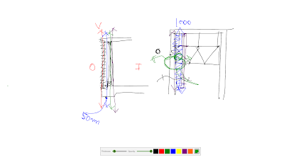
Okay, this 1st one, was actually a scribble from 3rd year, but most of my class notes are largely interchangeable. This looks at brick veneer wall, and considers the arrangement of the various skins or lines that constitute that wall. With the following question. What are the architectural and structural implications if we reorganise the sequence of these lines, and expand the spaces in between?
(Think about this one for a while).
WD: The usual submission requirements.
Timesheets and Markups are obligatory.
[RANT MODE ON] THERE ARE STILL SOME STUDENTS WHO HAVE NOT PRINTED LARGE FORMAT SETS, AND I HAVE YET TO SIGHT THEM. YOU KNOW WHO YOU ARE, AND I WILL BE INSISTING ON SEEING THEM NEXT CLASS. [RANT MODE OFF]

This one is a design image. Covering the crucial need to not let revit control the graphic outcome of your projects.
- all arrows point up (not down)
- do not use default hand rails.
- simplify furniture, most times outlines are enough.
- use a scale bar not an odd ratio.
- small key legend is preferable to room tags.
Simple message here. Design is inclusive, that is the influences (dare I say context again!!!) inform the scheme and graphic.
Do not forget the data tower, it is a requirement in the brief.
Also information being collected from the site has to be conveyed to the general public on site. This has to be conveyed in the final scheme. Key physical elements have to be included. Bike paths, river, trees and contours (minimum, not negotiable).

The plans have to include more than a nod and a wink to the BCA. At the very least, Doors need to open in the path of travel. Stairs need to comply. some of the sections I have seen, have conveniently ignored stair geometry. Make sure they work.
This image is about the incongruities I am seeing about the graphic quality of the floor plans. Each plan graphic needs to relate to the floors above and below them.
Design one again, tones not hatches.
Glass as black.
WD. This is a critical detail, I am seeing the same solution a number of times, which is far from convincing.


No comments:
Post a Comment