3D to 2D
To summarise latest class.
Use Virginia Macleod's books as a style guide benchmark.
Also take a look at Andrew Watts' book, Modern Construction Envelopes, if you are concerned your design imagination has gotten ahead of your ideas to build or document it.
...and to those brave students who took the plunge to move their autocad backgrounds from black to white, well done.
"you've taken your
first step in a larger world".
Showing posts with label Design. Show all posts
Showing posts with label Design. Show all posts
Friday, 16 March 2018


Thursday, 24 August 2017
Design Notes Post
Pre Design Stage
 This is by no means a definitive checklist.
But gives some indication of the process and background data required to work on this project.
While this information may not be directly included on the final submission, not researching this data will be evident in the errors within the project, or the thoroughness of the design response.

But gives some indication of the process and background data required to work on this project.
While this information may not be directly included on the final submission, not researching this data will be evident in the errors within the project, or the thoroughness of the design response.
Thursday, 4 May 2017



Tuesday, 28 March 2017
Catching up.
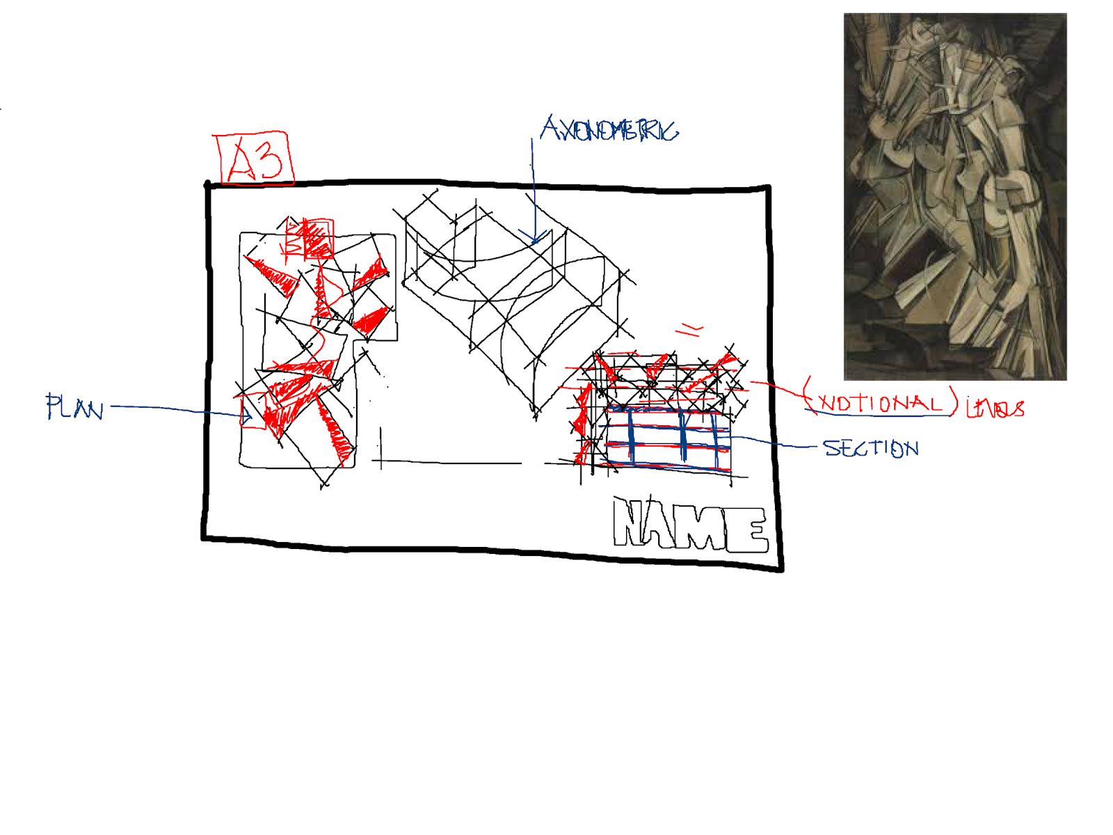
Trying to post up all the notes from the last 2 weeks WD and DES to clear my desktop, so here goes...Post-analysis under each image...
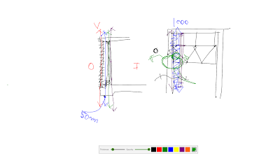
Okay, this 1st one, was actually a scribble from 3rd year, but most of my class notes are largely interchangeable. This looks at brick veneer wall, and considers the arrangement of the various skins or lines that constitute that wall. With the following question. What are the architectural and structural implications if we reorganise the sequence of these lines, and expand the spaces in between?
(Think about this one for a while).

WD: The usual submission requirements.
Timesheets and Markups are obligatory.
[RANT MODE ON] THERE ARE STILL SOME STUDENTS WHO HAVE NOT PRINTED LARGE FORMAT SETS, AND I HAVE YET TO SIGHT THEM. YOU KNOW WHO YOU ARE, AND I WILL BE INSISTING ON SEEING THEM NEXT CLASS. [RANT MODE OFF]

This one is a design image. Covering the crucial need to not let revit control the graphic outcome of your projects.
 Simple message here. Design is inclusive, that is the influences (dare I say context again!!!) inform the scheme and graphic.
Do not forget the data tower, it is a requirement in the brief.
Also information being collected from the site has to be conveyed to the general public on site. This has to be conveyed in the final scheme. Key physical elements have to be included. Bike paths, river, trees and contours (minimum, not negotiable).

The plans have to include more than a nod and a wink to the BCA. At the very least, Doors need to open in the path of travel. Stairs need to comply. some of the sections I have seen, have conveniently ignored stair geometry. Make sure they work.

This image is about the incongruities I am seeing about the graphic quality of the floor plans. Each plan graphic needs to relate to the floors above and below them.

Design one again, tones not hatches.
Glass as black.

WD. This is a critical detail, I am seeing the same solution a number of times, which is far from convincing.
 another pick just reminding ppl of the details required for this project.

Okay, this 1st one, was actually a scribble from 3rd year, but most of my class notes are largely interchangeable. This looks at brick veneer wall, and considers the arrangement of the various skins or lines that constitute that wall. With the following question. What are the architectural and structural implications if we reorganise the sequence of these lines, and expand the spaces in between?
(Think about this one for a while).

WD: The usual submission requirements.
Timesheets and Markups are obligatory.
[RANT MODE ON] THERE ARE STILL SOME STUDENTS WHO HAVE NOT PRINTED LARGE FORMAT SETS, AND I HAVE YET TO SIGHT THEM. YOU KNOW WHO YOU ARE, AND I WILL BE INSISTING ON SEEING THEM NEXT CLASS. [RANT MODE OFF]

This one is a design image. Covering the crucial need to not let revit control the graphic outcome of your projects.
- all arrows point up (not down)
- do not use default hand rails.
- simplify furniture, most times outlines are enough.
- use a scale bar not an odd ratio.
- small key legend is preferable to room tags.

Do not forget the data tower, it is a requirement in the brief.
Also information being collected from the site has to be conveyed to the general public on site. This has to be conveyed in the final scheme. Key physical elements have to be included. Bike paths, river, trees and contours (minimum, not negotiable).
The plans have to include more than a nod and a wink to the BCA. At the very least, Doors need to open in the path of travel. Stairs need to comply. some of the sections I have seen, have conveniently ignored stair geometry. Make sure they work.

This image is about the incongruities I am seeing about the graphic quality of the floor plans. Each plan graphic needs to relate to the floors above and below them.

Design one again, tones not hatches.
Glass as black.

WD. This is a critical detail, I am seeing the same solution a number of times, which is far from convincing.
 another pick just reminding ppl of the details required for this project.
Thursday, 3 September 2015
Design Studio
Today's discussion was all about architectural tectonics.
Here is an elaboration of the points I was making in class.
The emphasis we have placed this year has been on design as form making. The sculptural aspects of the 3D object.
After last week's preliminary presentations, many of the submissions have now reached a point where the form of the building has moved from nebulous arrangement of spaces to nearly realised object.
Design now needs to take a more nuanced approach.

MATERIALS:
Consider carefully now, the materials palette which the group is proposing for the building.
If it is brick consider whether the building dimensions are to brick module. What colour, and manufacturing process has been used, is it wire cut, pressed? How are they to be laid, traditional or robotic.
As I said the analogy is like a painter intuitively understanding the media. How the oils can be mixed, on the palette, with what variety and combination of tools they can be applied to the canvas, (if indeed it is that media), and how they can be blended once applied. Then there is the composition of the image etc.
ELEMENTS:
Do not ignore structure. Students informing me, that all the walls are loadbearing, have forgotten about flexibility of internal spaces, (open narratives) or appropriate material selections, or typical construction types. Load bearing pre-cast concrete is not suitable for the scale or budget of this project.
the way in which particular architectural elements are used is one of the chief means by which a building can be made to convey meaning. Consequently, the articulation of these elements, such as in the rendering of a wall, the spacing and particular style of windows or choice of roof cladding material, can vary dramatically. Reading Architecture - a visual lexicon
Please revisit the work of Sam Mockbee and Rural Studio. Watch again the documentary 'Citizen Architect' (available via RMIT Library). I am not trying to create clones of that aesthetic, but the pragmatic approach to form and use of material is exemplified in the design process.
Here is an elaboration of the points I was making in class.
The emphasis we have placed this year has been on design as form making. The sculptural aspects of the 3D object.
After last week's preliminary presentations, many of the submissions have now reached a point where the form of the building has moved from nebulous arrangement of spaces to nearly realised object.
Design now needs to take a more nuanced approach.

MATERIALS:
Consider carefully now, the materials palette which the group is proposing for the building.
If it is brick consider whether the building dimensions are to brick module. What colour, and manufacturing process has been used, is it wire cut, pressed? How are they to be laid, traditional or robotic.
As I said the analogy is like a painter intuitively understanding the media. How the oils can be mixed, on the palette, with what variety and combination of tools they can be applied to the canvas, (if indeed it is that media), and how they can be blended once applied. Then there is the composition of the image etc.
ELEMENTS:
Do not ignore structure. Students informing me, that all the walls are loadbearing, have forgotten about flexibility of internal spaces, (open narratives) or appropriate material selections, or typical construction types. Load bearing pre-cast concrete is not suitable for the scale or budget of this project.
the way in which particular architectural elements are used is one of the chief means by which a building can be made to convey meaning. Consequently, the articulation of these elements, such as in the rendering of a wall, the spacing and particular style of windows or choice of roof cladding material, can vary dramatically. Reading Architecture - a visual lexicon
Please revisit the work of Sam Mockbee and Rural Studio. Watch again the documentary 'Citizen Architect' (available via RMIT Library). I am not trying to create clones of that aesthetic, but the pragmatic approach to form and use of material is exemplified in the design process.
Thursday, 13 August 2015
Design Floor Plans & Other stuff
Apologies to 2A for the truncated class. There may be one or two more small hiccups along the way, but I will give you more notice if anything more disruptive comes along....

Floor Plans.
Once again, revit has a tendency to suck the life out of a scheme.
1. If your group has more than one scheme, it is now time to hybridise and get the best of both worlds onto one page. Don't rely on the class room popular vote. Your decisions should be based on the functional, logical and efficient layout of spaces.
Be respectful.
2, Zoom out, squint a little bit and look at the plan form as a series of sculptured volumes. Does the internal arrangements, have an impact on the forms and solids of the building as a whole. Imagine the view from google earth, is the scheme coherent and of a consistent design language? Should it be?

3. Relate it back to the conceptual design posters/ images of the last few weeks. Has the floor plan reflected the group polemic. You should be able to trace some lineage of the plan scheme as presented with the underlying conceptual design position. They should not be seen as distinctly different exercises.
4. TEST: Get the furniture/ joinery into the plan, not for rendering purposes, but to validate storage spaces and the proportions of rooms. Does the community meeting room actually work with 10,18, 24 seat arrangements?
5. Get the plan developed, but don't over commit.
print out ELEVATIONS
6. Start looking at the material selections and planar compositions of the elevations. Changes in height can reflect the differing intimacy of rooms or the importance of others.
The elevations will have an impact on the plan. They should. Elevations are not an afterthought or merely dictated by revit default elements.
For next week.
Parts 1-4
 |
| Elevation studies capture light/ shadow, material/ texture. and form. |
For next week.
Parts 1-4
Thursday, 6 August 2015

Thursday, 30 July 2015


Tuesday, 28 July 2015
History
A shout out to all last year's students that did not see out the History lectures.
They are currently running in Building 94 Level 1 6:00pm on Tuesday Nights. If you missed last year's through indifference, here is a chance to catch them now.
They are insightful, thought provoking and a welcome reminder how important it is for design to understand its past.
They are currently running in Building 94 Level 1 6:00pm on Tuesday Nights. If you missed last year's through indifference, here is a chance to catch them now.
They are insightful, thought provoking and a welcome reminder how important it is for design to understand its past.
Friday, 24 July 2015
Comm Design Review Week 1
Week 1
Is all about forming groups and getting the logistics sorted as to:- who is doing what?
- where that information is stored,
- and how it is shared.
- Pre-Design Research
- Physical
- Materials
- Building Types
- Building Forms
- Topology
- Planning
- Regulatory Constraints
- Planning Overlays
- History Recent and Past
- BAL
- BCA: Basic Classification check and routine planning considerations for a public building
- Australian Standards relating to:
- Extension and geometry of the off-street carparking
- Disabled Access Code
- Design
- Kinder and Child Care Regs
- Men's Shed Movement
Probably best if the information is tabulated or in a spreadsheet, and I recommend the google apps suite, as it is collaborative and easy to distribute.
Have the data ready week 1 so the designing/ brainstorming can be good to go start of week 2.
I don't see any value in a group presentation of the pre-design data, but I do want to review the groups individually to see what has been collated. So have it stored/ formatted in a meaningful manner.
Thursday, 28 May 2015
Simple Images Convey clear information
Plan Geometry Breakdown


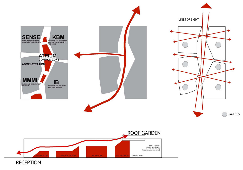
Concept/ Design Process

Remember: Design is about the idea. Don't let the tools limit your creativity.

The final image is an amalgam of software.
Monday, 25 May 2015
Preliminary Design Submission.
This is an outline of what is required for this Thursday's presentation.
It is indicative only, and should not be considered a checklist.
It is indicative only, and should not be considered a checklist.
- Bio/ front page
- (2A Dark Grey/ 2C Dark Red)
- Photo
- Your narrative +5 years
- Project Design Response, Architecture (Learning) Building
- Plans
- Sections
- Elevations
- 3D views
- Location Drawing
- Site Analysis
- Materials Selection
- BCA checks
- Distance of paths of travel to exits.
- Presentation: A5 Portrait colour physical print.
- Bring blu-tac or magnets for pin up!
- PDF presentation in class. (Save the file as a "reduced pdf" )
Remember CONTEXT, design projects are always grounded by the existing conditions. Isolated projects/ graphics are less convincing. The presentation should not be like a WD and you need to balance the limits of the generating software, with some sense of ambiguity.
The project is about conveying a design concept. (also google architectural diagrams for style cues.)
Earlier student examples are on my issuu site
Earlier student examples are on my issuu site
Note:
The design project makes manifest a range of other subjects, (courses) within the program.
- Construction: Structure
- Codes and Standards
- Materials
- ESD
While there is not explicit reference to these subjects, their information is inherent in the design process.
Friday, 8 May 2015
Design Week 3
- Continue work on modifications of room space arrangements. (paper), as per feedback/ discussion from studio. (from some of the illogical positioning of spaces on plan, there appeared little evidence of bubble diagram combinations being tested).
- Put plans into Revit. Excluding external walls.
- Levels 7,8 and 9 to be added to your block/ building 94 model.
- Print out the 4 elevation views of the model.
- Print out 1 or 2 axonometric views of the model.
- The axonometric view, is to get a sense of the massing of the building, to get a sense of the voids and circulation you are planning.
- Overlay paper on print outs.
- Draw / develop some elevational studies with a focus on massing, composition and materials. For presentation, next studio.
 This is a famous image by the Swiss/ French Architect Le Corbusier; 'Dom-ino' (Domus Innovation) (1914) Imagine tracing an exterior shape, building, form over this image. That is what you will be doing with your Revit model.
Thursday, 16 April 2015
DESIGN: MP:02

Results from the previous project are being worked on now.
Again it is really important to get started on this one as quickly as possible.
In groups, start modelling the Site.
For the next class, bring a camera so we can start looking for typological elements that can be used as a feeder to the design concept.
Also take a look online at the references mentioned above.
Thursday, 19 March 2015
Today's notes
A bit of a yak about grading method, and a quick look at Alex Hogrefe.
Some previous student work focusing on a limited colour palette and clean cad line work, referencing the publishing house birkhauser,

Some previous student work focusing on a limited colour palette and clean cad line work, referencing the publishing house birkhauser,
Thursday, 12 March 2015
Week 5
Image Manipulation of Model Photographs

This is a process to avoid only one software fixated outcome.
Subscribe to:
Posts (Atom)